Bleh!
Due to confusion about whether or not my TED Talk grading post counts towards my total (6) blog posts, I've just learned that I have to do another blog post!
Pretend that this came before the epilogue.
So, let's talk about my presentation-designing process, which took place over the second half of spring break.
Day 1, Thursday, 3/28:
Dear Diary,
The trudge through my redesign has made me weary. Much experience was gained from it, though, and my project has finally reached fruition. I've decided to set up camp for the night and craft my next blog post.
I have just completed my fifth blog post and can feel my creative juices flowing. It's time; I must begin my TED Talk script. I will only rest when it is complete.
The moon is in the House of Jupiter tonight and sleep beckons. My script is only two minutes long when recited. I'll just lie down for 30 minutes.
Day 2, Friday, 3/29:
Good Morning,
Last night did not go as planned. I fell asleep at the mere time of 0:38, expecting to work until early morn. Ah well, what can I do? I must return to my script after breakfast*.
Ah, toasted bagel and peanut butter, best eaten while watching YouTube videos. After the past two days, I feel that I deserve this break.
It is now 16:00; time has slipped me by. I shall force myself to write now, but only after I have found something to lunch* on.
Through much dilly-dallying, lunch has blended into dinner. This day has been very unsuccessful. I think I will reward myself with some fish stew.
21:00, and I'm now typing away. The fish seems to have given me the get-to-itiveness that I require, though my quilt calls to me. One unproductive day couldn't hurt, right?
*note that breakfast and lunch are eaten on a teenager's schedule; from 10:00-12:00 and 13:00-16:00, respectively.
Day 3, Saturday, 3/30:
Salutations,
These past four days have been spent living by the shoreside. The winds have changed and it is now time to return to the forest. May chance allow this metal wagon to carry me home.
The trip was favorable but there is now field work to be done. We must retrieve pebbles from an overturned barrow. It is high noon.
Sat back at my familiar computer chair, writing and designing await me.
Many hours of work have blurred into one. My script has been completed and revised. This tome demands much thought. The night is over.
Day 4, Sunday, 3/31:
The sun has awoken me and the day must be seized. Breakfast may wait; the script demands further revision.
A familial gathering is planned for later, so I must be swift in designing these slides. It seems to come naturally, though my blasted foot has not received sufficient blood flow. Frequent breaks must be taken to reawaken it.
The presentation is all but completed and Eostre's feast must be attended. The metal wagon awaits.
Food and drink have been had, though the feast has afflicted me with a "head-ache". The piercing pain is reminiscent of a pike being driven into one's skull. Still, the work demands continuation.
Words and visuals planned, all that is left is to practice. It is now 21:00. Note cards must be designed.
Day 5, Monday, 4/1:
3:10. My delusional mind is satisfied. The script is known and the presentation is sleek. A viewer must react to my genius (project presentation). Mother shall be awakened.
She likes it. A small change has been made to it. I am done with it. My mind must be taken off of it so I can sleep it out and present it in the morn.
-End of Journal-
Note that some creative liberties were taken, but, for the most part, that's true. I do wish that I had started a day earlier, but overall, I'm happy.
Still recovering from early Monday morning, but happy. I cannot believe that it's done.
Resources Used:
16 different image hosters (because I used their images in my presentation).
My mom.
All of my energy ever.
Wednesday, April 3, 2013
The Epilogue
So the TED Talk was a success. But man, it was a tough one to achieve.
Due to many projects converging over spring break, distracting shifts from home to shore to back, and mild but consequential procrastination (or, as I like to call it, trying to relax), I ended up with only about three days to write my script, create my powerpoint, and practice, practice, practice.
It may be my sleep-deprived and nervous self talking, but given the amount of time to create and the relative success of my talk, I think I am developing a knack for presenting.
I mean, my script was a draft written through Thursday and Friday and revised out of necessity on Saturday and Sunday. At the same time, it was praised by my "unbiased" professional writer mother and I think I remember complements on it through the blur that was first period.
My powerpoint was designed entirely on Sunday and was also praised by many. I think most of my knack belongs to that. Only one small change to it was made by the suggestion of my mother. Man, she helped me work out the kinks a lot, didn't she?
And my delivery, which I felt was dry, included some proper enunciation and emphasis. I'm also quite happy with my answers of the Q&A questions. Overall, I think my graded presentation was a great success. Heck, even McDaniels complemented me on it.
So, onto grading; let's do it based on the exact guidelines. One thing that the old Word Doc assignment sheet is good for is providing text that one can copy and paste:
- Four to Five Minutes. More like six, but it still fit in the time frame. 1/1
- Visual component: Felt really spot-on; always went with what I was saying. 6/6
- PPT, Prezi, other? 1/6
- Creative and supplemental. You drive the presentation, not the visual. 5/6
- Content: Very well thought out but did not allow for real inspiration. 7/8
- Inspire through your passion 1/8
- Show your product 2/8
- Explain your process 2/8
- What is your purpose? What should your audience take away from your project? 2/8
- Organization: hook, transitions, logical order, effective conclusion. Hook could've been a good bit stronger. 4/5
- Delivery: refined, poised, and enthusiastic. Not entirely enthusiastic; dry. 5.5/7
- Following of the TED Commandments. Right on the mark for many of them. 3/3
OVERALL SCORE: 26.5/30
Tired Ethan thinks it's fair to give an A to Presenting Ethan.
Now let's recover from this wild but mundane ride. It's amazing how much praise I got for presenting cleanly at school when I have this inner guilt for creating the presentation messily at home.
Just click "slow download"; the other one leads to a signup program.
Or a link to the Google Doc version of the presentation.
Or a link to the Google Doc version of the presentation.
This is probably my last blog post in the history of this project. I'm gonna make cyber-tears now.
/\ /\ /\ /\ /\ /\
/ \ / \ / \ / \ / \ / \
( ) ( ) ( ) ( ) ( ) ( )
'''''''''' '''''''''' '''''''''' '''''''''' '''''''''' ''''''''''
They look like mustachioed noses. Perfection.
Thursday, March 28, 2013
Volume Five
Hoo man, I never knew that Spring Breaks could be busy. Granted, you can take a couple of days off to start with, but then you've gotta go back to the grind stone (or iMac, depending on what era you live in). For example, I spent the last nine (NINE!) hours finishing up this bad boy:

Wait, it's too small to see? Bwahahahaa... now you must either read through my entire spiel or scroll to the bottom of this post in order to see the full version! My master plan is unfolding!
Redesigning assignment sheets is actually a fairly engaging process for me; I found that every aspect of the task came rather naturally to me. So, how did I do it? What steps did I take in designing this 10-pixel-tall masterpiece?
Well, I'll tell you.
Step 1] Take all of the raw information from the assignment sheet out.
(I put it here)
Step 2] Whittle that down to the vital information.

(Turns out that most of the information is vital)
Step 3] Bring the information into Adobe Illustrator section-by-section.

(A section which describes the overall project, duh)
Step 4] Geez, design the layout already.

(Recreated after the final design was finished)
Step 5] Spend half a day working... and done.

(The longest step)
Now that I'm finally done with that, I'll collapse into bed. In retrospect, while I definitely felt my previous practice layouts helped me in this process, I think that it would've been smart to skip the Four Principles of Design and started my work on this layout a week earlier. Still, I'm pretty darn happy with the final product.
I would like to thank the Academy, my parents, and last.fm's never-ending stream of Impressionist and Romantic music.
TED Talk in four days! Oi vey.
Resources Used:
It's all in my head.
Resources Used:
It's all in my head.
Tuesday, March 19, 2013
Volume Four
Hello once again, fellow cheeses! It's been a long nine hours since I posted last, and I'm raring to post some more.
*throws hammer at a table* "Order in the court! The case of the day is Reilly v. the State of Pennsylvania. The prosecutor claims that Ethan Reilly has been designing layouts without a license. Will the prosecutor present his evidence?"
"Why, yes, your highness. Presented on this web page are FOUR layouts illegally designed by the illiterate criminal!"
Exhibit A: A layout named "Balance", designed on March 17!

Exhibit B: Brutishly called "Rhythm", this piece was designed on the SAME DAY as "Balance". A double offense!

Exhibit C: "Emphasis" is next. All that this vagabond has emphasized is his criminality!

Exhibit D: And the crown offense, a layout sarcastically dubbed "Unity". This one was hand-made, of all things! What an evil design.

"As the court can see, this outlaw has betrayed design law on four accounts! He must be prosecuted to the full extent of the law!"
"Ah, what a case! What does the defendant have to say?"
"I didn't do it, man. It wasn't me... plus, I have a license! Look, maaan." *hands the judge a $100 bill*
"Hmm... I see. Though it has a strange green tint and your identification picture looks awfully like Benjamin Franklin, it seems to check out. You're free!"
"Noooooooo!!! My last chaaannnnnceee! Dad won't let me live at home anymore!"
THE END
Ah, well that was fun. In case you haven't seen it, there's a timelapse of the creation of "Unity" in my vlog. Not much else to say; no real challenges that I've faced this week. Next week, you'll get to see my final layout, and the week after will include my TED Talk process.
Resources used:
Siebert, Lori, and Lisa Ballard. "The Elements of Design: Space, Size, Value, Color." Making a Good Layout. Cincinnati, OH: North Light, 1992. N. pag. 28-37 Print.
*throws hammer at a table* "Order in the court! The case of the day is Reilly v. the State of Pennsylvania. The prosecutor claims that Ethan Reilly has been designing layouts without a license. Will the prosecutor present his evidence?"
"Why, yes, your highness. Presented on this web page are FOUR layouts illegally designed by the illiterate criminal!"
Exhibit A: A layout named "Balance", designed on March 17!


"Ah, what a case! What does the defendant have to say?"
"I didn't do it, man. It wasn't me... plus, I have a license! Look, maaan." *hands the judge a $100 bill*
"Hmm... I see. Though it has a strange green tint and your identification picture looks awfully like Benjamin Franklin, it seems to check out. You're free!"
"Noooooooo!!! My last chaaannnnnceee! Dad won't let me live at home anymore!"
THE END
Ah, well that was fun. In case you haven't seen it, there's a timelapse of the creation of "Unity" in my vlog. Not much else to say; no real challenges that I've faced this week. Next week, you'll get to see my final layout, and the week after will include my TED Talk process.
Resources used:
Siebert, Lori, and Lisa Ballard. "The Elements of Design: Space, Size, Value, Color." Making a Good Layout. Cincinnati, OH: North Light, 1992. N. pag. 28-37 Print.
Monday, March 18, 2013
The Interlude
DAS GeniusVlog from Ethan R on Vimeo.
Ah, Vimeo. You take a long time to process videos.
Anyway, along with my rather boring answering of vlog prompts, I've included a timelapse of my design process!
Also, for those of you who think the timelaspe music sounds jazzy, find it on YouTube under "Community Medley".
Monday, March 11, 2013
Volume Three
Ah, week three; back in the groove. I've been pretty successful this week and have been able to cut my average designing time down to 1 - 1.5 hours. Plus, I kept to my designated schedule pretty well, designing two layouts over the course of last week, one over this weekend, and one more today. Here're the most recent fruits of my labor:
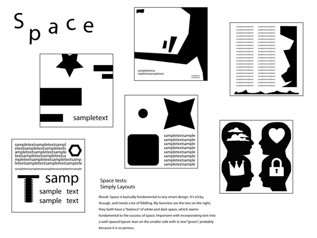
1) Space (click for a larger image)
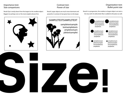
 2) Size
 3) Value
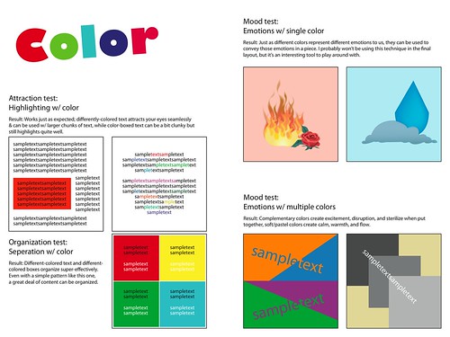
 4) Color
 Had quite a good time designing these guys (thanks to a number of wonderful podcasts and playlists). Though, for some reason, I feel like I haven't learned as much this week as I did last. It may be because my other projects are pushing things out of my mind (Curse you, Valjean! I'll make you rue the day that you became sad.). Then again, it could just be that I'm not giving myself enough credit for how much I know about these four topics.
My trusty handbook, Making a Good Layout, is still aiding me like how a St. Bernard aids Alpine climbers. If you want to know about what I've been learning about from it, take a look at the experiments that I conduct on my layouts; they express the key concepts of the book pretty well. If you've got no time to spare and can only read over one, I suggest Color. I think it captures the essence of what I'm trying to do with these layouts.
No real troubles this week, but no great achievements. I'll just continue on to next week, when I'll finish these practice layouts once and for all.
1) Space (click for a larger image)
An exploration of how white space can pad text, create tension, and open up a piece.
A look through the basics of how different sizes can attract, send messages, and organize.
Various tests on how varying shades can affect a layout.
The most lively of the layouts, this one includes research on how various colors affect perception.
My trusty handbook, Making a Good Layout, is still aiding me like how a St. Bernard aids Alpine climbers. If you want to know about what I've been learning about from it, take a look at the experiments that I conduct on my layouts; they express the key concepts of the book pretty well. If you've got no time to spare and can only read over one, I suggest Color. I think it captures the essence of what I'm trying to do with these layouts.
No real troubles this week, but no great achievements. I'll just continue on to next week, when I'll finish these practice layouts once and for all.
Resources used:
Siebert, Lori, and Lisa Ballard. "The Elements of Design: Space, Size, Value, Color." Making a
Good Layout. Cincinnati, OH: North Light, 1992. N. pag. 18-25 Print.
Monday, March 4, 2013
Volume Two
Ooh, weird week, complete with its own group of setbacks:
- Each layout has been taking longer than expected (1-2 hours each).
- I am still low-energy from my sickness a week and a half ago.
- I've been really busy with other work & have found it hard to keep up with this project.
Anyway, Week 2 has shown some good progress, with three layouts completed.
Click these links to view them:
As you can see, I'm taking these exercises in an experimental way, with tests and recorded results. These will be very helpful when making my final layout.
It feels quite good to have those three done, and you can expect four more in the next post.
Let's break down the time that I spend working on each of these:
As I said, I spend anywhere from 1 to 2 hours on each layout. Respectively, 40 to 80 minutes of that time is spent either reading my book on design, Making a Good Layout by Lori Siebert and Lisa Ballard, or working off of it. For example, if a layout only takes me an hour, I'll spend about ten minutes gleaming information off of it and then another thirty conducting experiments in my layout based on what the book suggests. The rest of the time is generally spent conducting my own experiments and messing around with visuals.
Right now, Making a Good Layout is the only source of information that I have for this project. It provides all of the information that I need for the Elements and Principles of Design, but once I get to the point of designing my final layout, I may consult other texts on how to put it all together.
I think I've learned a good deal about the Elements that I've designed for so far, especially for Shape. I've noticed, though, that the layout for Shape took the longest to make, so if I really want to learn about each of these Elements and Principles, I'll have to modify my schedule a bit. For as long as I have to make four layouts every cycle, I'll make three from days 1-4 and the last one on day 5. Then, I'll write and finish my blog on day 6.
Alright, I think that's all for now. Until next week!
Resources used:
Siebert, Lori, and Lisa Ballard. "The Elements of Design: Line, Shape, Texture." Making a
Good Layout. Cincinnati, OH: North Light, 1992. N. pag. 12-17 Print.
Tuesday, February 26, 2013
Volume One
Ah, sickness. Sure, it's great to lay in bed for half of the day in a groggy fog, but what's better than making up the work that you missed the second night after you return to school? It sends shivers down my spine.
Anyway, I guess that recent sickness did result in something okay: plenty of time to ponder what I would like to purposefully pursue for the next six weeks. 'Ooh, an open-ended Gifted project,' I thought, 'I should probably just do something that I enjoy, right?' Thus, here is my unedited and hardly-remembered list of things that I don't mind doing:
Anyway, I guess that recent sickness did result in something okay: plenty of time to ponder what I would like to purposefully pursue for the next six weeks. 'Ooh, an open-ended Gifted project,' I thought, 'I should probably just do something that I enjoy, right?' Thus, here is my unedited and hardly-remembered list of things that I don't mind doing:
- Programming (it makes me feel clever)
- Engineering (ditto)
- Playing Settlers of Catan (my theme reader knows this well)
- Graphic design (ah, an artistic expression that doesn't require materials and result in mess)
- Playing Minecraft (a fair place to express of architectural ideas)
- Writing blog posts (ooh, that would make this project really easy, wouldn't it?)
I wonder what I chose.
So, graphic design, eh? Why that? Well, there's more than one reason:
Week 1 Week 2 Week 3 Week 4 Week 5 Week 6
)____________|_____________|_____________|_____________|_____________|_____________|>
[Make 1 test layout for each Element & Principle of Design][Design final layout][TED Talk]
During the first four weeks of this project, I plan on refining my current design ability by making a practice layout for all 11 of the Elements & Principles of Design. This will be done with the aid of my trusty reading material, Making a Good Layout by Lori Siebert & Lisa Ballard, which goes into depth about each Element and Principle. For example, one of the elements of design is line, so my layout for that would be toying around with what I can evoke with lines and what I can make into lines. By the end of the fourth week, I expect to have each element and principle down pat.
This is where the real challenge comes in: between weeks five and six, I'm going to redesign the assignment sheet for this project using the 11 elements and principles to make it look awesome.
Finally, there's the TED Talk. I don't have much of a plan for that yet.
In case I haven't expressed them clearly enough above, here's the required entries for each blog, just to make sure that they're in here:
Measurable Goals:
So, graphic design, eh? Why that? Well, there's more than one reason:
- I like it (already established)
- My dad likes it (he's a graphic designer by profession, so I guess it's rubbed off a bit)
- I'm very comfortable with Photoshop and Illustrator (my "talent" has left my work in Computer Graphics class an example for future students)
- I'm a creative mind (following instructions doesn't feel right for this project)
An example of my graphic design ability as of last year.
Yeah. So now that we've got the basics in place, let's get into the nitty gritty details, via timeline.
Week 1 Week 2 Week 3 Week 4 Week 5 Week 6
)____________|_____________|_____________|_____________|_____________|_____________|>
[Make 1 test layout for each Element & Principle of Design][Design final layout][TED Talk]
During the first four weeks of this project, I plan on refining my current design ability by making a practice layout for all 11 of the Elements & Principles of Design. This will be done with the aid of my trusty reading material, Making a Good Layout by Lori Siebert & Lisa Ballard, which goes into depth about each Element and Principle. For example, one of the elements of design is line, so my layout for that would be toying around with what I can evoke with lines and what I can make into lines. By the end of the fourth week, I expect to have each element and principle down pat.
This is where the real challenge comes in: between weeks five and six, I'm going to redesign the assignment sheet for this project using the 11 elements and principles to make it look awesome.
Finally, there's the TED Talk. I don't have much of a plan for that yet.
In case I haven't expressed them clearly enough above, here's the required entries for each blog, just to make sure that they're in here:
Measurable Goals:
What
are your goals? To learn about the E's & P's of Design & To make the assignment sheet look gorgeous and easy to decipher.
How will you measure your progress/achievement? More-or-less by how many layouts I have completed and how good I think they are. If I feel like I'm learning, I'll know that I'm doing well.
Discoveries and Setbacks:
Don't really think I have any major ones so far, how about this: I've discovered how much I have to learn about graphic design, and I've been set back by my accursed sickness.
Look, Ma, a cyclical ending!
Subscribe to:
Posts (Atom)