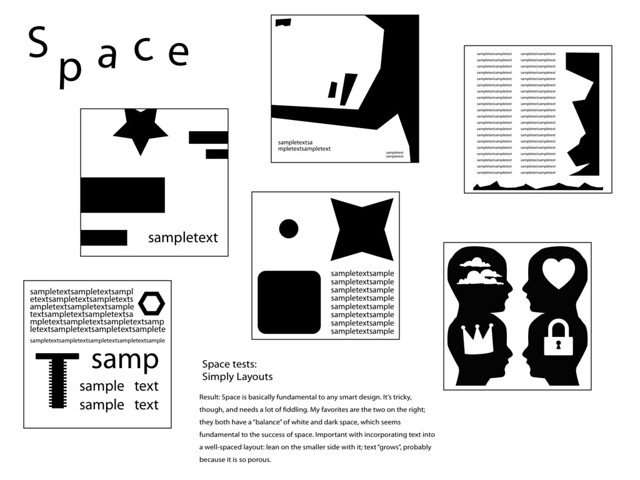
1) Space (click for a larger image)
An exploration of how white space can pad text, create tension, and open up a piece.
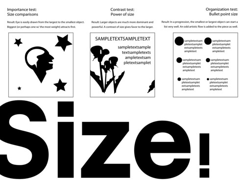
A look through the basics of how different sizes can attract, send messages, and organize.
Various tests on how varying shades can affect a layout.

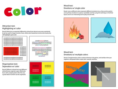
The most lively of the layouts, this one includes research on how various colors affect perception.
My trusty handbook, Making a Good Layout, is still aiding me like how a St. Bernard aids Alpine climbers. If you want to know about what I've been learning about from it, take a look at the experiments that I conduct on my layouts; they express the key concepts of the book pretty well. If you've got no time to spare and can only read over one, I suggest Color. I think it captures the essence of what I'm trying to do with these layouts.
No real troubles this week, but no great achievements. I'll just continue on to next week, when I'll finish these practice layouts once and for all.
Resources used:
Siebert, Lori, and Lisa Ballard. "The Elements of Design: Space, Size, Value, Color." Making a
Good Layout. Cincinnati, OH: North Light, 1992. N. pag. 18-25 Print.
I can see that you are making progress. After seeing your work from the previous post, I think I have the general idea of what purpose these designs serve, but I am still a little confused. Are these layouts meant to be a representation of the concepts you have learned, or are they meant to act as a guide for others who wish to pursue graphic design? Whatever the exact job of them, they look very professional, and, even before looking at a close-up of the designs, I could see the different techniques that help a graphic designer to accomplish his/her goal.
ReplyDeleteI'd say that they're more of a representation of what I've learned.
DeleteHello Ethan, this is Noah, I’m glad to see that you haven’t run into any obstacles this week, in your great quest to learn layout and design. However, I was a little concerned that you think that you might have hit a lull in your learning of the art, and I think I might be able to layout a good plan for you. I think that instead of just going through the book page by page (as I suspect you are from my experience with your ethaness) you should look at all the concepts briefly identify which would be easy to complete and which would be difficult, then parcel them out accordingly (i.e. some easy and some hard every week). I’m sure that you are learning new concepts at a good pace, but if you want to kick it into overdrive/go hardcore, you can always learn more than your weekly quota of design concepts. I hope that this has been helpful, and if not, then you just have to deal, you know how I be.
ReplyDeletePeace on the Street,
Noah Gilly
Too late! I'm already done with the concepts! Bwahahahahaaaa!
DeleteGreat to see you're back on track. Your website is really well designed (Let's hope so, if that's the project). The humor is helpful as opposed to distracting. Personal favorite: "Look ma, a cyclical ending!" Oh, huzzah. As far as the actual project, what if you were to find a document without any formatting and post it here after editing it? That way we could see some of your designing in action. I do like the test pages though.
ReplyDeleteFor my final layout, I think I'll document the process with various files at the different stages of the project. Thanks for inciting that idea!
DeleteGreat work, Ethan! I've enjoyed reading about your progress.
ReplyDeleteThey're more of the basics of design. I think that I'm pretty ready for the project!
ReplyDelete