Thursday, March 28, 2013

Volume Five

Hoo man, I never knew that Spring Breaks could be busy. Granted, you can take a couple of days off to start with, but then you've gotta go back to the grind stone (or iMac, depending on what era you live in). For example, I spent the last nine (NINE!) hours finishing up this bad boy:


Wait, it's too small to see? Bwahahahaa... now you must either read through my entire spiel or scroll to the bottom of this post in order to see the full version! My master plan is unfolding!

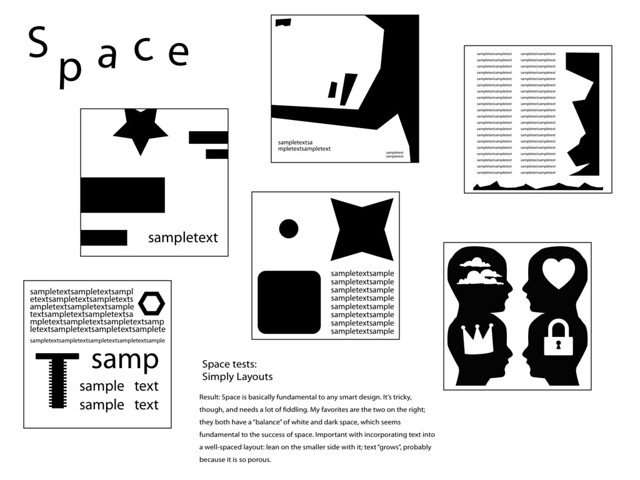
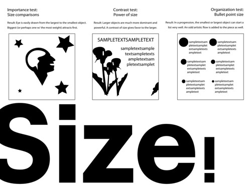
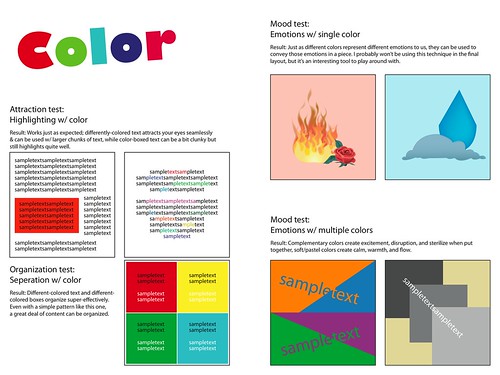
Redesigning assignment sheets is actually a fairly engaging process for me; I found that every aspect of the task came rather naturally to me. So, how did I do it? What steps did I take in designing this 10-pixel-tall masterpiece?

Well, I'll tell you.

Step 1] Take all of the raw information from the assignment sheet out.
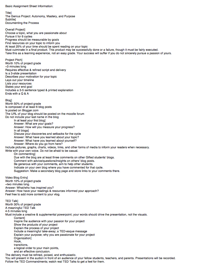
(I put it here)

Step 2] Whittle that down to the vital information.

(Turns out that most of the information is vital)

Step 3] Bring the information into Adobe Illustrator section-by-section.

(A section which describes the overall project, duh)

Step 4] Geez, design the layout already.

(Recreated after the final design was finished)

Step 5] Spend half a day working... and done.

 (The longest step)

Now that I'm finally done with that, I'll collapse into bed. In retrospect, while I definitely felt my previous practice layouts helped me in this process, I think that it would've been smart to skip the Four Principles of Design and started my work on this layout a week earlier. Still, I'm pretty darn happy with the final product.

I would like to thank the Academy, my parents, and last.fm's never-ending stream of Impressionist and Romantic music.

TED Talk in four days! Oi vey.

Resources Used:
It's all in my head.

Tuesday, March 19, 2013

Volume Four

Hello once again, fellow cheeses! It's been a long nine hours since I posted last, and I'm raring to post some more.

*throws hammer at a table* "Order in the court! The case of the day is Reilly v. the State of Pennsylvania. The prosecutor claims that Ethan Reilly has been designing layouts without a license. Will the prosecutor present his evidence?"

"Why, yes, your highness. Presented on this web page are FOUR layouts illegally designed by the illiterate criminal!"

Exhibit A: A layout named "Balance", designed on March 17!

Exhibit B: Brutishly called "Rhythm", this piece was designed on the SAME DAY as "Balance". A double offense!

Exhibit C: "Emphasis" is next. All that this vagabond has emphasized is his criminality!

Exhibit D: And the crown offense, a layout sarcastically dubbed "Unity". This one was hand-made, of all things! What an evil design.

"As the court can see, this outlaw has betrayed design law on four accounts! He must be prosecuted to the full extent of the law!"

"Ah, what a case! What does the defendant have to say?"

"I didn't do it, man. It wasn't me... plus, I have a license! Look, maaan." *hands the judge a $100 bill*

"Hmm... I see. Though it has a strange green tint and your identification picture looks awfully like Benjamin Franklin, it seems to check out. You're free!"

"Noooooooo!!! My last chaaannnnnceee! Dad won't let me live at home anymore!"

THE END


Ah, well that was fun. In case you haven't seen it, there's a timelapse of the creation of "Unity" in my vlog. Not much else to say; no real challenges that I've faced this week. Next week, you'll get to see my final layout, and the week after will include my TED Talk process.

Resources used: 
Siebert, Lori, and Lisa Ballard. "The Elements of Design: Space, Size, Value, Color." Making a           Good Layout. Cincinnati, OH: North Light, 1992. N. pag. 28-37 Print. 

Monday, March 18, 2013

The Interlude


DAS GeniusVlog from Ethan R on Vimeo.

Ah, Vimeo. You take a long time to process videos.

Anyway, along with my rather boring answering of vlog prompts, I've included a timelapse of my design process!

Also, for those of you who think the timelaspe music sounds jazzy, find it on YouTube under "Community Medley".

Monday, March 11, 2013

Volume Three

Ah, week three; back in the groove. I've been pretty successful this week and have been able to cut my average designing time down to 1 - 1.5 hours. Plus, I kept to my designated schedule pretty well, designing two layouts over the course of last week, one over this weekend, and one more today. Here're the most recent fruits of my labor:

1) Space (click for a larger image)
An exploration of how white space can pad text, create tension, and open up a piece.
SpaceGenius
2) Size
A look through the basics of how different sizes can attract, send messages, and organize.
SizeGenius
3) Value
Various tests on how varying shades can affect a layout.
ValueGenius
4) Color
The most lively of the layouts, this one includes research on how various colors affect perception.
ColorGenius
Had quite a good time designing these guys (thanks to a number of wonderful podcasts and playlists). Though, for some reason, I feel like I haven't learned as much this week as I did last. It may be because my other projects are pushing things out of my mind (Curse you, Valjean! I'll make you rue the day that you became sad.). Then again, it could just be that I'm not giving myself enough credit for how much I know about these four topics.

My trusty handbook, Making a Good Layout, is still aiding me like how a St. Bernard aids Alpine climbers. If you want to know about what I've been learning about from it, take a look at the experiments that I conduct on my layouts; they express the key concepts of the book pretty well. If you've got no time to spare and can only read over one, I suggest Color. I think it captures the essence of what I'm trying to do with these layouts.

No real troubles this week, but no great achievements. I'll just continue on to next week, when I'll finish these practice layouts once and for all.


Resources used:
Siebert, Lori, and Lisa Ballard. "The Elements of Design: Space, Size, Value, Color." Making a
          Good Layout. Cincinnati, OH: North Light, 1992. N. pag. 18-25 Print.

Monday, March 4, 2013

Volume Two


Ooh, weird week, complete with its own group of setbacks:
  1. Each layout has been taking longer than expected (1-2 hours each).
  2. I am still low-energy from my sickness a week and a half ago.
  3. I've been really busy with other work & have found it hard to keep up with this project.
Anyway, Week 2 has shown some good progress, with three layouts completed.

Click these links to view them:

  1. Line
  2. Shape
  3. Texture
As you can see, I'm taking these exercises in an experimental way, with tests and recorded results. These will be very helpful when making my final layout.
It feels quite good to have those three done, and you can expect four more in the next post.

Let's break down the time that I spend working on each of these:
As I said, I spend anywhere from 1 to 2 hours on each layout. Respectively, 40 to 80 minutes of that time is spent either reading my book on design, Making a Good Layout by Lori Siebert and Lisa Ballard, or working off of it. For example, if a layout only takes me an hour, I'll spend about ten minutes gleaming information off of it and then another thirty conducting experiments in my layout based on what the book suggests. The rest of the time is generally spent conducting my own experiments and messing around with visuals.

Right now, Making a Good Layout is the only source of information that I have for this project. It provides all of the information that I need for the Elements and Principles of Design, but once I get to the point of designing my final layout, I may consult other texts on how to put it all together.

I think I've learned a good deal about the Elements that I've designed for so far, especially for Shape. I've noticed, though, that the layout for Shape took the longest to make, so if I really want to learn about each of these Elements and Principles, I'll have to modify my schedule a bit. For as long as I have to make four layouts every cycle, I'll make three from days 1-4 and the last one on day 5. Then, I'll write and finish my blog on day 6.

Alright, I think that's all for now. Until next week!

Resources used:
Siebert, Lori, and Lisa Ballard. "The Elements of Design: Line, Shape, Texture." Making a
          Good Layout. Cincinnati, OH: North Light, 1992. N. pag. 12-17 Print.